library(tidyverse)

## Bird data

birds <- read_csv("https://zenodo.org/records/6511860/files/Lele_et_al._2022_BITR-21-373_raw_data.csv")

antvireo <- birds |>
  filter(SPECIES == "PLAIN ANTVIREO") |>
  # remove abnormal birds
  filter(BILL.LENGTH > 5)

antvireo.bill <- antvireo$BILL.LENGTH |>
  na.omit()

## Job advert data

jobs <- read_csv("https://zenodo.org/records/14771706/files/adzuna_month_ttwa_vacancies_with_hourly_wage_panel.csv")

# take a subset
# whole dataset is too large!
hourly.jobs <- jobs$vacancies_offering_an_hourly_wage[1:100]7 Transforming data
7.1 Importance of normality Data
For this walkthrough, we will use two datasets - one with normal data, and one with non-normal data.
Our normal dataset is drawn from measurements of birds in western Ecuador, collected by several friends of Dr. Cooper, where we will be specifically looking at measurements of the Plain Antvireo Dysithamnus mentalis (Lele et al. 2022).
Our non-normal dataset counts the number of job vacancies offering an hourly wage by region in the United Kingdom for different time periods (Urban Big Data Centre 2025).
7.2 Testing if data are normal
There are two major methods we can use to see if data are normally distributed.
7.2.1 Histograms
One of the first things that you should do is look at a histogram of your data. Histograms will help you spot any large data irregularities, and can help you get an idea of whether you should expect you data to be non-normally distributed.
First, let’s look at our antvireo.bill data:
hist(antvireo.bill)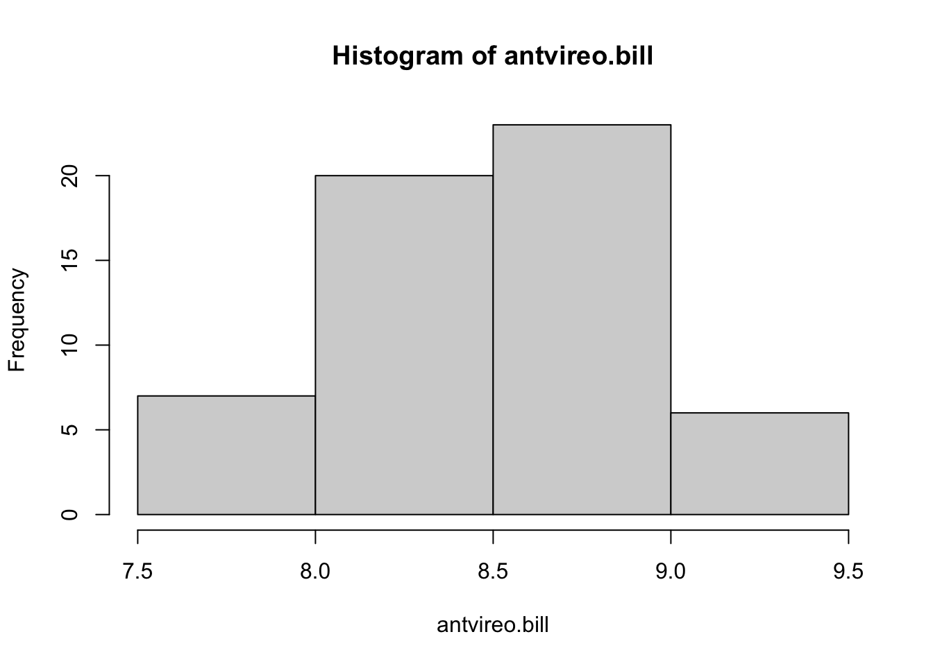
These data appear relatively normal.
Next, let’s look at the hourly.jobs data.
hist(hourly.jobs)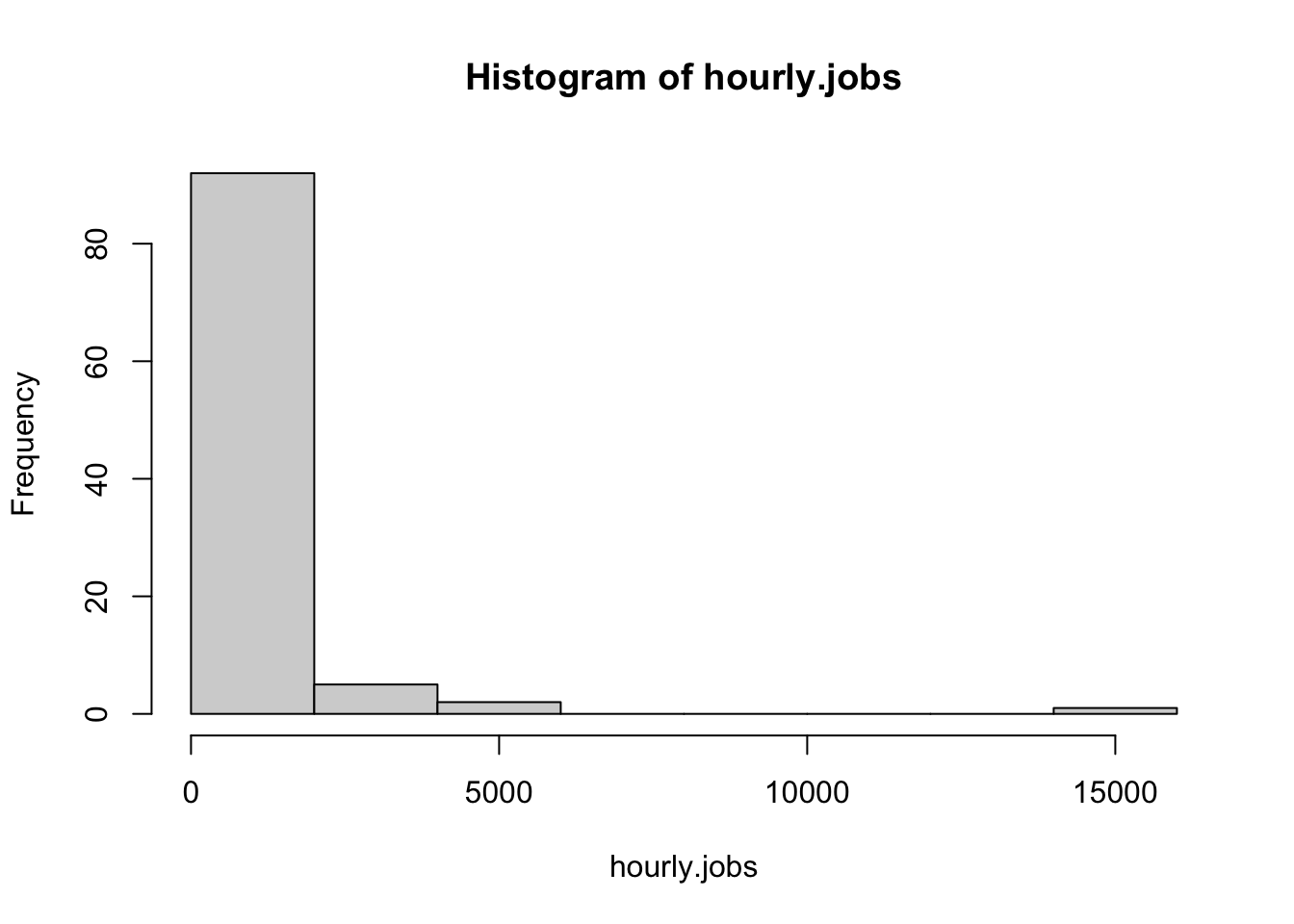
These data appear highly non-normal; most values are low, and we have an extreme right skew.
7.2.2 QQ Plots
Visual method for assessing normality
One way to see if data are normal is to use a QQ plot. These plot data quantiles to theoretical quantiles to see how well they align, with a perfectly normal distribution having a completely linear QQ plot. Let’s look at these with our antvireo.bill data.
qqnorm(antvireo.bill)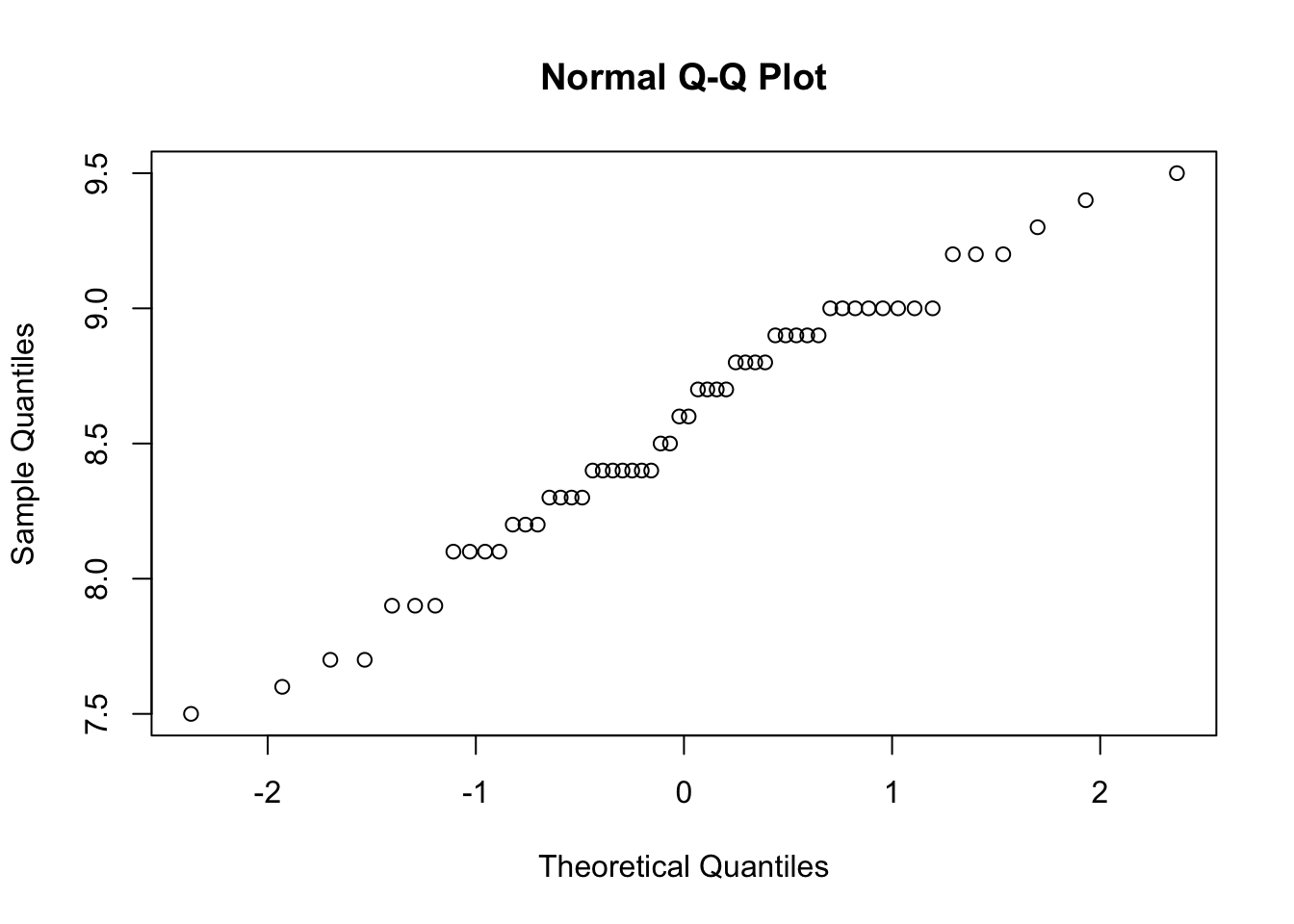
As we can see above, the data are roughly linear, which means are data appear normal. The “stairsteps” are from the accuracy in measuring temperature, which was likely rounded and thus created a distribution that is not completely continuous.
Now, lets check how our hourly.jobs data look:
qqnorm(hourly.jobs)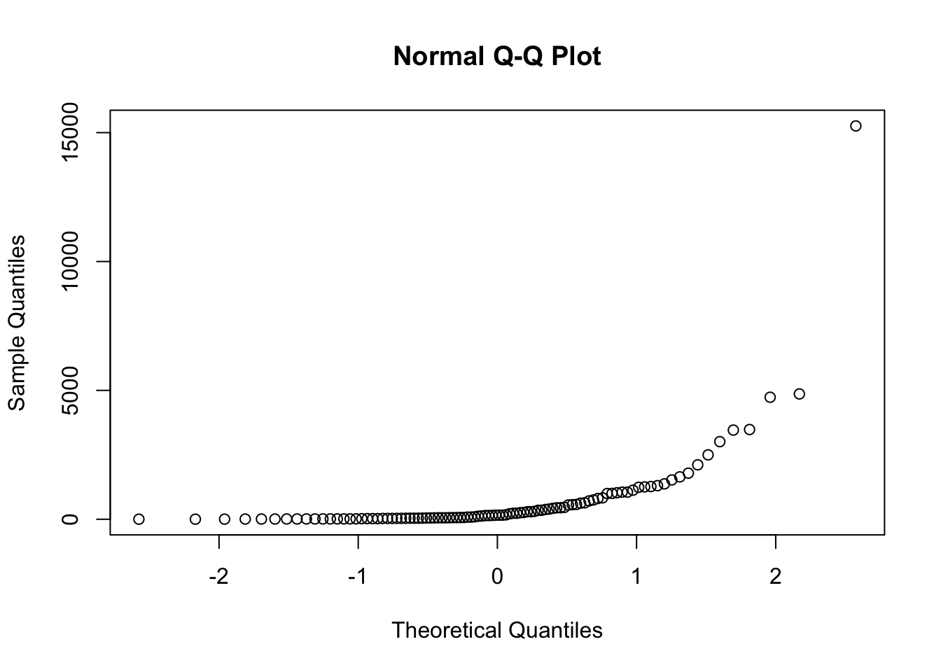
As we can see, these data are not very linear, suggesting that the data are highly non-normal.
7.2.3 Shapiro-Wilk test
Statistical method for assessing normality
Another way to test for normality is to use a Shapiro-Wilk test of normality. We will not get into the specifics of this distribution, but this tests the null hypothesis that data originated in a normal distribution, with the alternative hypothesis that the data originated in a non-normal distribution.
NOTE that the Shapiro-Wilk test does not perform well with extremely large datasets, which may be the result of model overfitting.
This test uses an \(\alpha = 0.05\), and we reject the null hypothesis if our \(p < \alpha\), with \(p\) representing the probability of observing something as extreme or more extreme than the result we observe. If we reject the null hypothesis, our data are non-normal and require transformation. If we accept the null hypothesis, we can proceed with treating our data as normally distributed.
Let’s look at the antvireo.bill data:
shapiro.test(antvireo.bill)
    Shapiro-Wilk normality test

data:  antvireo.bill
W = 0.97513, p-value = 0.2984
As we expected from our qqnorm plot, our data for the Plain Antvireo bills are normally distributed, and we accept the null hypothesis as \(p>\alpha\) with \(0.30 > 0.05\).
Next, let’s do a Shapiro-Wilks test on our hourly.jobs data.
shapiro.test(hourly.jobs)
    Shapiro-Wilk normality test

data:  hourly.jobs
W = 0.39393, p-value < 2.2e-16
As we can see, our \(p < 0.001\), therefore we reject the null hypothesis and conclude the hourly.jobs data are non-normal.
7.3 Transforming data
There are multiply different transformations that can be performed on different datasets. In this class, we will focus on three transformations:
- Log transformations, some of the most common transformations
- Square transformations
- Square-root transformations
Note: there are many other types of transformations, we just don’t go in depth with them here.
When transforming a dataset, you must perform the mathematical function across all values within the dataset. You can then assess whether this dataset is normally distributed and determine whether you can proceed with statistical analyses that you would perform on normal distributions.
The process for all transformations is the same, so this walkthrough will only perform one: the log transformation.
7.3.1 Log transformation example
Walkthrough of a transformation for normality
We know that our hourly.jobs dataset is non-normally distributed, so we need to perform a transformation to see if we can achieve normality. Here, we will perform a log transformation. In R, the function log performs a natural log (\(ln\)) by default. Because \(ln(0)\) is \(-Infinity\), folks will often add \(+1\) to their entire dataset to avoid zero values. We can do this by using the command log1p, which has the back-transformation of expm1.
Next, let’s perform the log transformation:
log.hourly.jobs <- hourly.jobs |>
  log1p()
Very straightforward! How do these data look?
hist(log.hourly.jobs)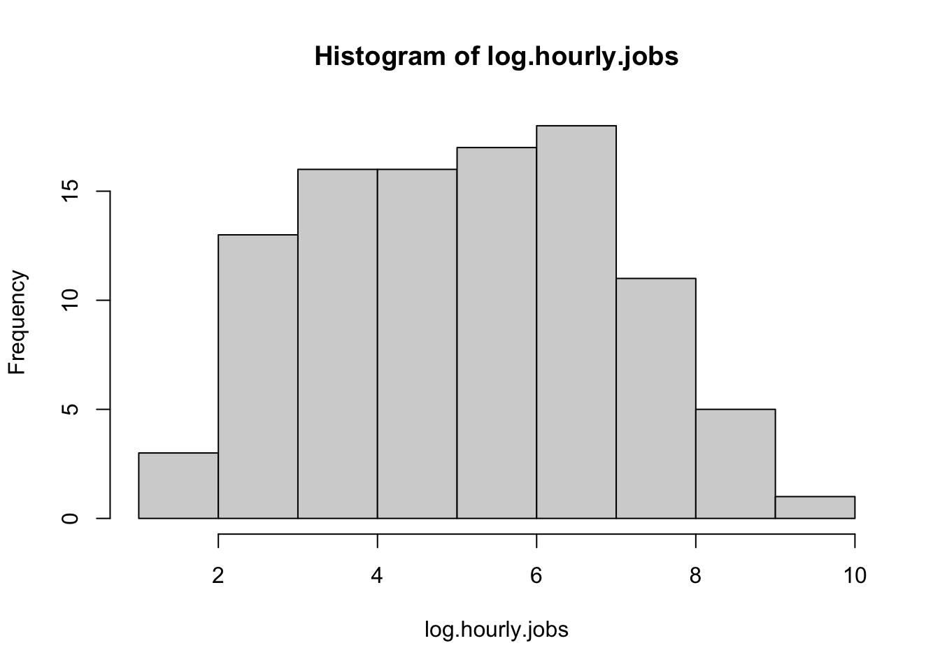
These data appear far more normal. What about on a qqplot?
qqnorm(log.hourly.jobs)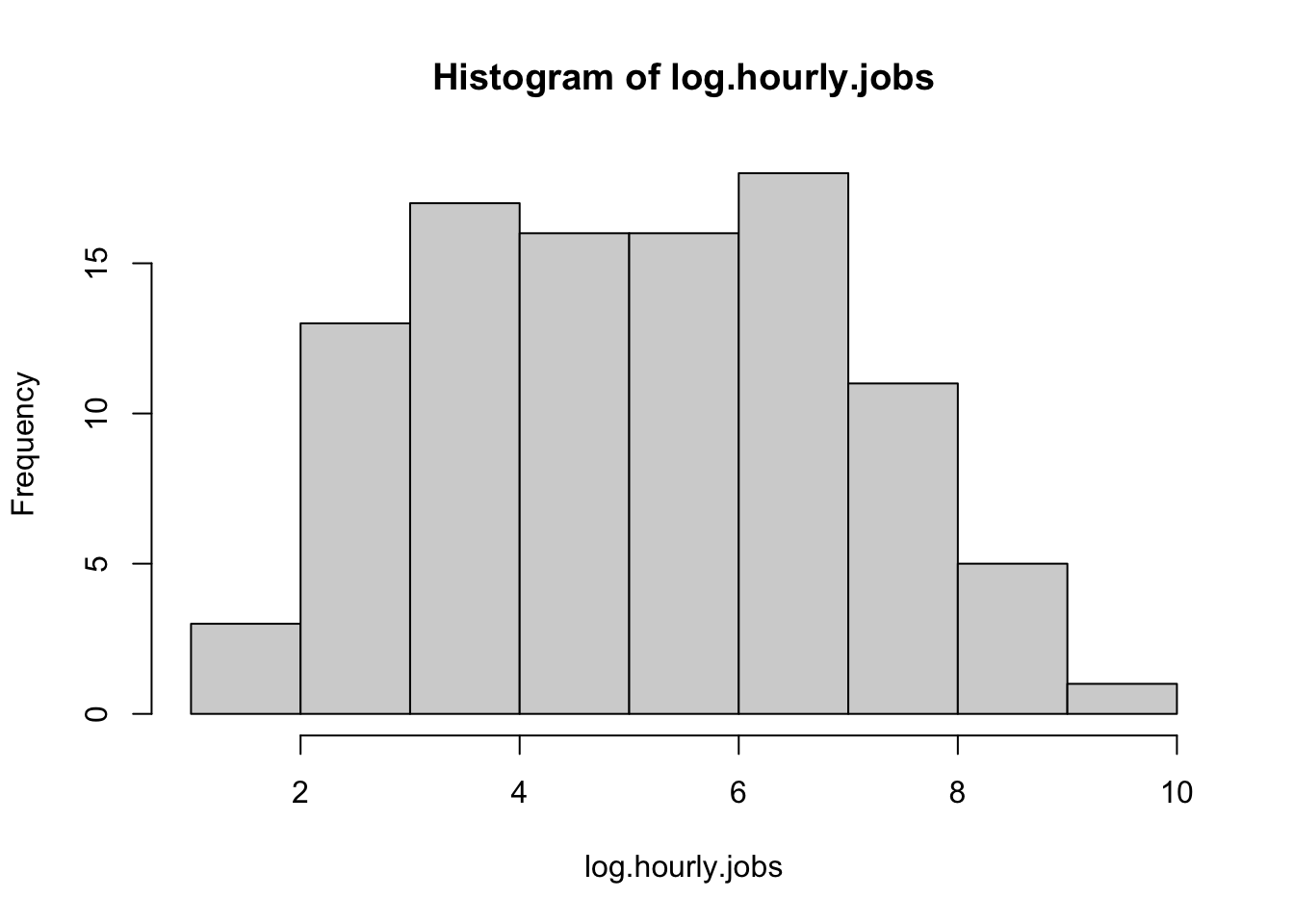
The line is much straighter, as is expected for a normal distribution.
Now, for the Shapiro-Wilk test:
shapiro.test(log.hourly.jobs)
    Shapiro-Wilk normality test

data:  log.hourly.jobs
W = 0.97964, p-value = 0.1245
We now have a \(p>\alpha\) with \(0.13>0.05\), indicating that these data are now normally distributed. We can now proceed with our analyses!
Note, however, that you must back transform your data after a transformation!
A back transformation of \(ln(x)\) is \(e^x\). In R, \(e\) is found by entering exp(1). Thus we would do the following if looking at the mean from the logs:
log.mean <- mean(log.hourly.jobs)

log.mean |> round(2)
[1] 5.08And back transformed:
transformed.log.mean <- expm1(log.mean)
transformed.log.mean |> round(0)
[1] 1597.4 Homework: Transforming data
This homework assignment is designed to help you become more familiar with manipulating data and with transforming data.
7.4.1 Analyzing data
Using the bird dataset above, pick two other species of birds and do the following:
- Provide information on the mean, median, mode, kurtosis, and skewness.
- Create a histogram of the data.
- Run a
shapiro.teston the data. - Determine if the data are normally distributed. If the data are normally distributed, you are done - go to the next species. Provide at least three pieces of evidence.
- If the data appear normal except for excessive skew, do a log transformation only. Otherwise, try at least two transformations to see if data are made normal. Transformations to try include \(x^2\), \(log(x+1)\), \(\sqrt{x}\).
- For each transformation, show a histogram, skewness, kurtosis, and a
shapiro.test. - Provide an assessment if the transformation achieves normality or not, citing three pieces of evidence.
7.4.2 Transforming Data
Using the below newly created data object, perform all the same steps as you did for the bird data above. Start with a log transformation.
hourly.jobs.homework <- jobs$vacancies_offering_an_hourly_wage[200:300]Note that hourly.jobs.homework is already a numeric vector, so you can just run mean(hourly.jobs.homework).
7.4.3 Submitting assignment
Submit your homework assignment as an html file on Canvas.