── Attaching core tidyverse packages ──────────────────────── tidyverse 2.0.0 ──
✔ dplyr     1.1.4     ✔ readr     2.1.6
✔ forcats   1.0.1     ✔ stringr   1.6.0
✔ ggplot2   4.0.1     ✔ tibble    3.3.0
✔ lubridate 1.9.4     ✔ tidyr     1.3.1
✔ purrr     1.2.0
── Conflicts ────────────────────────────────────────── tidyverse_conflicts() ──
✖ dplyr::filter() masks stats::filter()
✖ dplyr::lag()    masks stats::lag()
ℹ Use the conflicted package (<http://conflicted.r-lib.org/>) to force all conflicts to become errors
14.1 Introduction
When we are comparing two continuous variables, we use two forms of tests: correlation to understand if there is a relationship between two variables, and linear regression to determine what that relationships is.
Remember - “if” is always correlation, and “what is it” is always linear regression when choosing a test for an exam.
14.2 Correlation
Correlation - denoted by \(\rho\) (“rho”) and not to be confused with \(p\) - is a measure of how closely related to continuous variables appear to be. This can vary from a purely negative relationship to a purely positive relationship, such that \(-1 \le \rho \le 1\) with \(\rho = 0\) indicating a random relationship between data.
14.2.1 Examples of correlation
We can visualize these as follows:
### ILLUSTRATIVE PURPOSES ONLY# create two random uniform distributionsy <-runif(10)x <-runif(10)
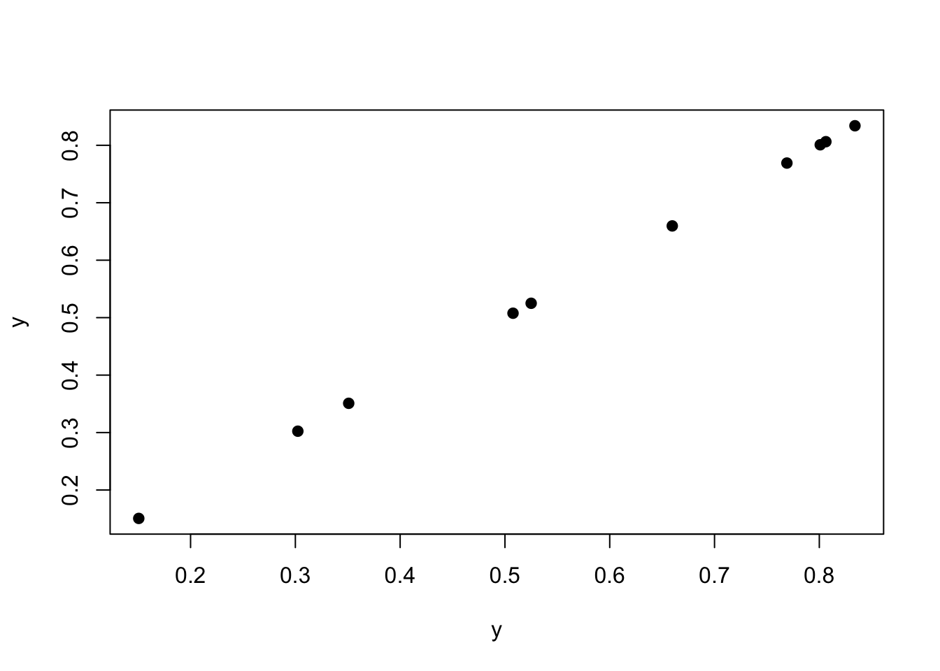
For example, two things compared to themselves have a \(\rho = 1\).
plot(y, y, pch =19)
cor(y, y)
[1] 1
As we can see above, the correlation is 1.
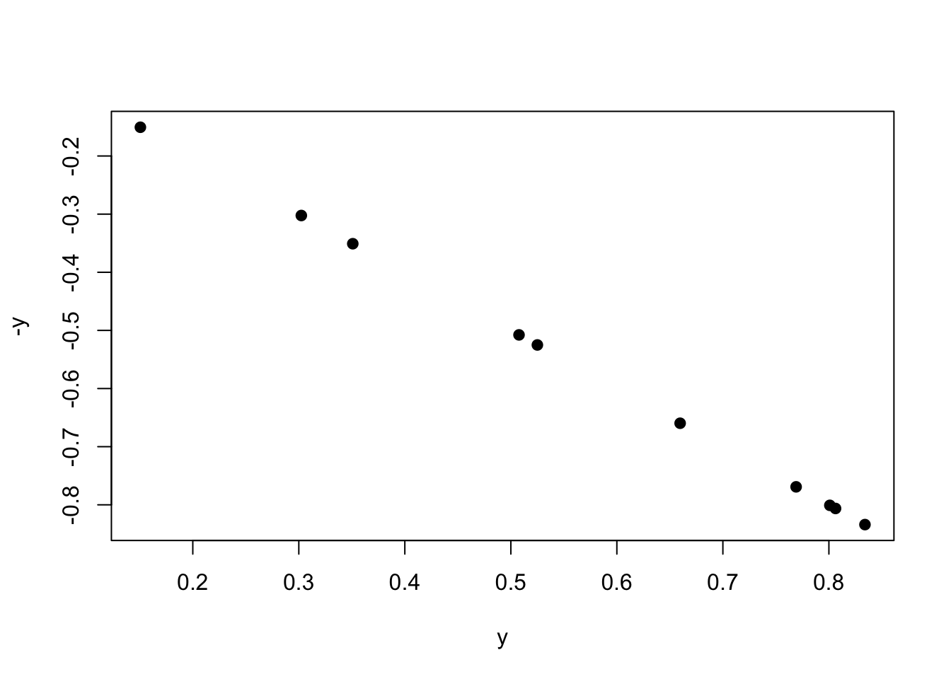
Plotting by the negative will be a correlation of -1.
plot(y, -y, pch =19)
cor(y, -y)
[1] -1
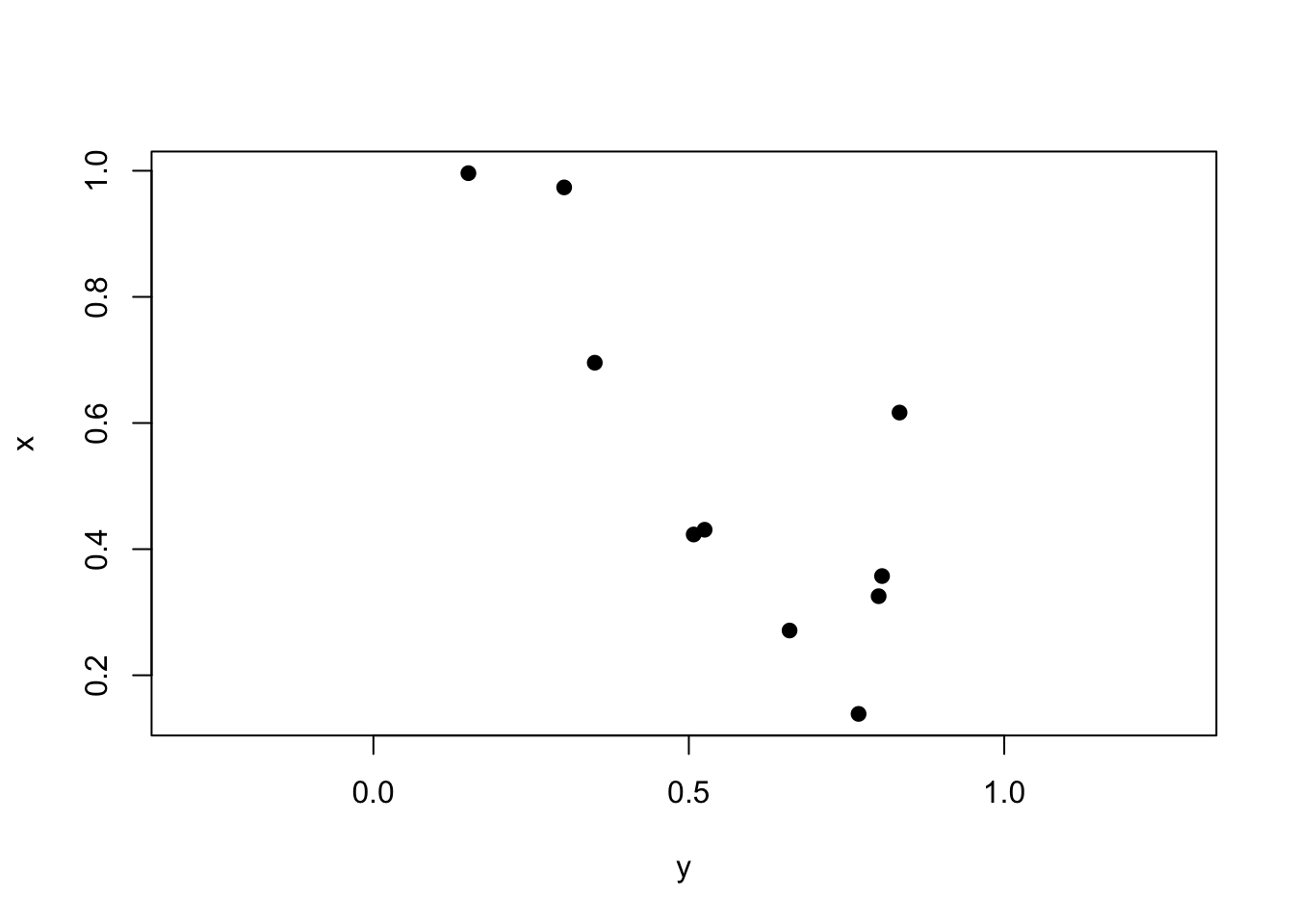
Lastly, two random variables plotted against each other should have \(\rho \approx 0\).
plot(y, x, pch =19, asp =1) # aspect ratio
cor(y, x) |>round(2)
[1] -0.11
14.2.2 Pearson’s
Pearson’s correlation coefficient is our value for parametric tests. We often denote our correlation coefficient as \(r\) and not \(\rho\) for this particular test. It is calculated as follows:
\[
r = \frac{\Sigma xy - (\frac{\Sigma x \Sigma y}{n})}{\sqrt{(\Sigma x^2 - \frac{(\Sigma x)^2}{n}})(\Sigma y^2 - \frac{(\Sigma y)^2}{n})}
\]
where \(x\) is variable 1, \(y\) is variable 2, and \(n\) is the total number of data point pairs.
In this class, we will be using R to calculate \(r\), which is done using the command cor. To ensure we are using the correct method, we need to set method = "pearson".
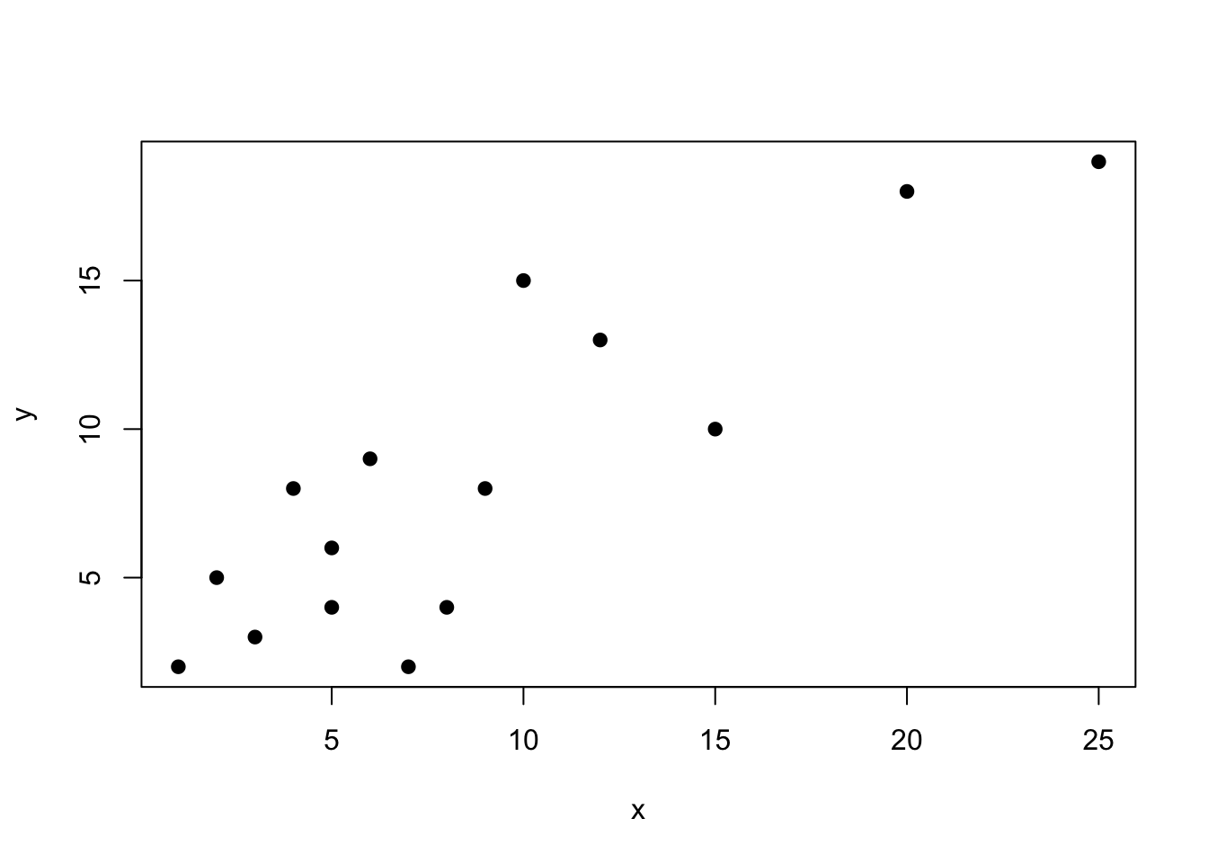
set.seed(8675309)### EXAMPLE DATAx <-c(1,2,5,3,4,5,8,7,9,6,10,12,15,20,25)y <-c(2,5,4,3,8,6,4,2,8,9,15,13,10,18,19)plot(x, y, pch =19)
cor(x, y, method ="pearson") |>round(2)
[1] 0.86
As we can see, these data are fairly positively correlated. As x increases, so does y. But how significant is this relationship?
Well, we can calculate two things - the amount of variation explained, which is \(r^2\), and the significance of the relationships, which is determined via a \(t\) test and the equation \(t=r \sqrt{\frac{n-2}{1-r^2}}\). This is a two-tailed distribution, with \(df = n-2\).
We can write a function to perform all of these options:
biol305_cor <-function(x=NA, y=NA, method ="pearson"){if(is.data.frame(x)==T){if(ncol(x)==2){ r <-cor(x[,1], x[,2], method = method) }else{ r <-cor(x, method = method) } r2 <- r r[r==1|r==-1] <-0 n <-2*nrow(x) }else{ r <-cor(x, y, method = method) n <-2*length(x) } t_val <- r*sqrt((n-2)/(1-r^2)) p <-pt(t_val, df = n -2) p[p >0.5] <-1- p[p >0.5] p[p >0.005] <-round(p[p >0.005],2) p[p >0.0005] <-round(p[p >0.0005],3) p[p >0.00005] <-round(p[p >0.00005],4) p[p <0.00005] <-"< 0.0001"if(is.data.frame(x)==T){print("Correlation:")print(round(r, 2))if(ncol(x) ==2){print(paste0("Degrees of freedom: ", n -2))print(paste0("t value: ", round(t_val, 2)))print(paste0("P value: ", p)) }if(ncol(x) >2){print(paste0("Degrees of freedom: ", n -2))print("")print("t value: ")print(round(t_val, 2))print("")print("P value: ")print(p) } }else{print(paste0("Correlation: ", round(r, 2)))print(paste0("Degrees of freedom: ", n -2))print(paste0("t value: ", round(t_val, 2)))print(paste0("P value: ", p)) }}
There we go! Our function printed out everything that we need.
14.2.3 Spearman’s
Spearman’s correlation is one of the non-parametric methods for our correlation tests. We can use this for ranked data or for non-parametric datasets. We do this the exact same way, except we change method = "spearman".
14.2.4 Other non-parametric methods
To be expanded upon, but not necessary for the class at present.
14.2.5 Reporting correlation
Per different online resources, we are defining the strength of relationships as follows. Be sure to use these terms in your conclusions! Note that this is unrelated to significance - which is p, and instead is noting the strength of the positive (or negative) correlation. These terms should only be used when \(p < 0.05\).
The values shown below are for\(|r|\). You will have to mention whether is it positive or negative.
Definitions for strength of correlation for this class, from StackOverflow.
Absolute value of r / \(\rho\)
Strength of relationship
\(r < 0.25\)
Very weak relationship / very weakly correlated
\(0.25 ≤ r < 0.5\)
Weak relationship / weakly correlated
\(0.5 ≤ r < 0.75\)
Moderate relationship / moderately correlated
\(0.75 ≤ r < 0.9\)
Strong relationship / strongly correlated
\(0.9 ≤ r\)
Very strong relationship / very strong correlation (can also just say “strong relationship”)
14.3 Regression
Regression is used when we want to know what the relationship is between two variables. Regression operates similar to ANOVA and correlation, providing us with the nature of the relationship, the strength of the relationship, and gives us values for calculating the relationship. For this class, we are only focusing on linear regression for relationships between linear variables.
The equation for a regression line is often written as \(y_i = \alpha + \beta x_i + e_i\), where \(\alpha\) is the \(y\) intercept, \(\beta\) is the slope, and \(e\) is the error around each point. We will not perform regression calculations by hand in this class.
14.3.1 Parametric
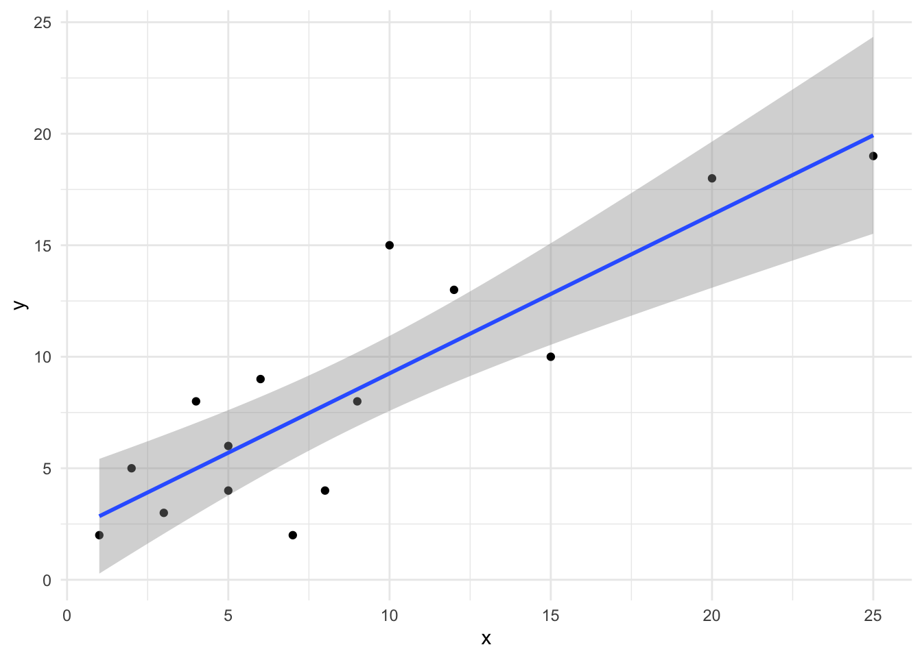
We will use out previous established x and y datasets that are strongly positively correlated for this example. The equation for calculating a linear relationship is lm, which stands for “linear model”. This uses equations like ANOVA, but can also use two vectors of data.
xy_linear <-lm(y ~ x)summary(xy_linear)
Call:
lm(formula = y ~ x)

Residuals:
    Min      1Q  Median      3Q     Max
-5.1189 -1.4838 -0.5423  1.9757  5.7460

Coefficients:
            Estimate Std. Error t value Pr(>|t|)
(Intercept)   2.1370     1.2825   1.666     0.12
x             0.7117     0.1169   6.086 3.87e-05 ***
---
Signif. codes:  0 '***' 0.001 '**' 0.01 '*' 0.05 '.' 0.1 ' ' 1

Residual standard error: 2.964 on 13 degrees of freedom
Multiple R-squared:  0.7402,    Adjusted R-squared:  0.7202
F-statistic: 37.04 on 1 and 13 DF,  p-value: 3.867e-05
As we can see, this returned an ANOVA table to use that tells us the value and significance of our intercept as well as the value and significance of the the slope (here, shown as x; it will always show the explanatory variable in this slot for the name).
Looking at the above, we can see that the slope is not significantly non-zero with a \(p = 0.12\), but that the slope is significantly non-zero with \(p < 0.0001\). We also have our \(R^2\) values returned, which is similar to the \(r\) we got for correlation. Indeed, our correlation was \(r = 0.86\), with \(r^2 = 0.74\), which is very similar to the Multiple R-squared shown in the above ANOVA table.
R has a built in function within ggplot that will add a linear model to our plot and will show error regions as well. First, we need to make sure our data are in a data.frame.
Just like that, we have created a plot of our linear regression. Note that you should always plot the lines only within the extent of the data; this is harder to do in other programs, but R does it for us!
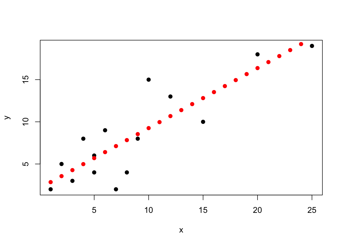
R can also allow us to predict different values using our linear model:
# must be in data frame formattest_data <-data.frame(1:25)colnames(test_data) <-"x"# must be same as explanatory in datapredict(xy_linear, test_data)
Let’s visualize these points for illustration’s sake.
plot(x, y, pch =19)points(1:25, as.numeric(predict(xy_linear, test_data)),pch =19, col ="red")
As we can see above, our points follow the line from the plot. By using this format, however, we can make predictions of value for any point we want.
14.3.2 Non-parametric
We are not doing non-parametric linear regression in this class.
14.4 Correlation Homework
For all problems, make sure that you:
List the null and alternative hypothesis
Determine which correlation test needs to be performed
When transforming data, you do not have to transform both variables at the same time - can relate a normally distributed variable to the square of another, etc.
Perform the appropriate correlation test
Plot your results using a scatterplot
Can use either plot or ggplot
Remember, no regression lines for correlation!
Report your conclusion
Remember, this needs to be a concise sentence (or sentences) and must have the test statistic, degrees of freedom, and p value listed parenthetically
Be sure to use the correct language for describing the strength of your relationship as seen in Reporting correlation
Compare your results to the listed answers; not that I use \(r\) in all instances for correlation, regardless of correlation test used
14.4.1 Q1: The Boeoegg
Per the tidytuesday website:
The Boeoegg is a snowman effigy made of cotton wool and stuffed with fireworks, created every year for Zurich’s “Sechselaeuten” spring festival. The saying goes that the quicker the Boeoeg’s head explodes, the finer the summer will be.
For this particular problem, we are interested in whether the time until the snowman’s head explodes (duration) is correlated with the average monthly temperature for a given year (tre200m0), the total sunshine duration hours (sre000m0), and the total monthly precipitation (rre150m0).
14.4.1.5 1.4: Based on all your answers above, is the snowman festival related to better weather?
14.4.2 Q2: Oops, more penguins
Reading more about penguins in Antarctica, you become fascinated by the Adelie Penguins that occur on multiple different islands. Specifically, you are interested in whether:
There is a relationship between bill length and bill depth, given that these are both related to diet
There is a relationship between bill length and flipper length, given that bill length is likely related to diet and flipper length may be related to foraging batter
You become interested in how video game designers balance different features to keep games enjoyable and competitive. You decide to analyze data for the Pokémon games to understand how different aspects of the characters are (or are not) balanced. Specifically, you decide to compare the hp stats, attack stats, defense stats, and special attack stats for each Pokémon.
14.4.3.1 3.1: Perform the correlation tests
Note that there is a fast way to plot all correlations… See if you can figure it out.
NOTE: this will involve multiple pairwise comparisons. Values for \(r\) are as follows:
poke_stats <- pokemon_df |>select(hp, attack, defense, special_attack)## NON PARAMETRIC FOR HP## NON PARAMETRIC FOR ATTACK## NON PARAMETRIC FOR DEFENSE## NON PARAMETRIC FOR SPECIAL ATTACK
HP vs. attack: \(stat = 62094825\), \(p < 0.0001\)
HP vs. defense: \(stat = 79004420\), \(p < 0.0001\)
HP vs. special: \(stat = 73478110\), \(p < 0.0001\)
Attack vs. defense: \(stat = 70515649\), \(p < 0.0001\)
Attack vs. special: \(stat = 91138612\), \(p < 0.0001\)
Defense vs. special: \(stat = 98148814\), \(p < 0.0001\)
14.4.3.2 3.2: Do these correlations make sense from a game-making perspective? How or how not?
14.4.4 Q4: Pixar films
You often check Rotten Tomatoes to see if a movie is worth watching or not, but you are aware that the Rotten Tomatoes score is from movie critics who review the movie. However, there are other sources like Metacritic that seem to source their reviews from other places. You want to see how related these different review systems are for Pixar films.
1 pt extra credit if you can figure out how to normalize the Rotten Tomatoes data! It is possible.
\(stat = 7.33\), \(p < 0.0001\), \(r = 0.85\)
\(stat = 363.02\), \(p < 0.0001\), \(r = 0.82\)
14.5 Regression Homework
14.5.1 Q1: UNK Remissions
UNK releases data on many metrics each year, including both budgetary and enrollment information. These data are publicly available via the STAR report. You want to use these data to see how recent scholarship budgeting changes have impacts different metrics.
For each part of this question, state if tuition spending has significantly changed the response variable. Make sure to include your statistics and \(p\)-value.
Do not normalize the remission percent data.
14.5.1.0.1 a.
Tuition remission spending has increased dramatically in the last few years. You want to know if this increased spending has increased the total number of first-time freshman.
Next, you want to see if this increased spending has led to an increase in quality of students. To measure this, you are going to use the ACT score. Since 2025 ACT scores for first-time freshman has not yet been released, you won’t be using 2025 data.
# Yearyear <-c(2016, 2017, 2018, 2019, 2020,2021, 2022, 2023, 2024)# Excluding 2025 due to ACT scores not being out for 2025remission_pct <-c(20.79, 21.28, 20.61, 22.09, 21.53,22.54, 22.54, 22.46, 25.65)# Percent of first-time freshmen with ACT score 22 or aboveACT22plus_pct <-c(52.97619048, 52.76548673, 49.04661017,51.68018540, 47.89915966, 42.37995825,47.85631518, 41.86813187, 45.48571429)unk_act <-data.frame(year, remission_pct, ACT22plus_pct)unk_act
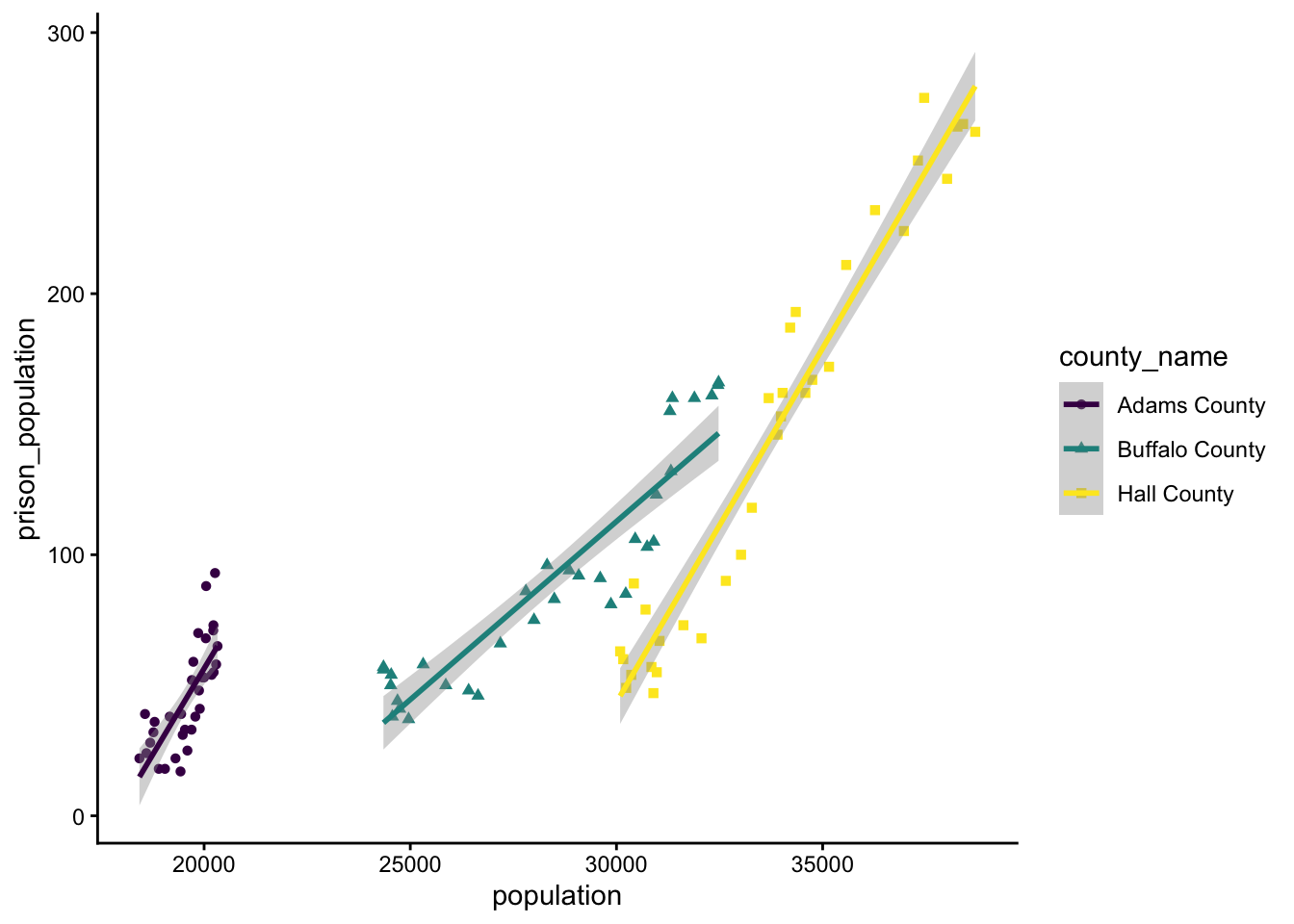
You are listening to local politicians on the news talk about what they are going to do regarding crime in central Nebraska. Curious about the data behind their claims, you download a dataset on prison populations in the tri-city area of Kearney (Buffalo County), Grand Island (Hall County), and Hastings (Adams County).
Given that an incarceration rate is the same as a slope of prisoners vs. total population, you decide to compare population to prison_population for each county independently and for the region as a whole.
Remember, you can look at groups individually by doing response ~ explanatory:group for your formula.
Assume data are normally distributed.
## This takes a while to loadprison <-read_csv("https://raw.githubusercontent.com/rfordatascience/tidytuesday/main/data/2019/2019-01-22/prison_population.csv") |>filter(state =="NE"& pop_category =="Total") |>filter(county_name %in%c("Buffalo County", "Hall County", "Adams County")) |> dplyr::select(year, county_name, population, prison_population) |>na.omit()
`geom_smooth()` using formula = 'y ~ x'
Note that the above plot also uses the ggplot commands theme_classic and scale_colour_viridis_d. Within the aes part of ggplot, you can tell it to separate things out by shape or colour. And yes, many commands do have Indian / African / British / Canadian English naming conventions, since these are more widespread.
Which county has the fastest increasing prison population?
Which county has the slowest increasing prison population?
What are the overall trends for the region?
14.5.3 Q3: Population Density
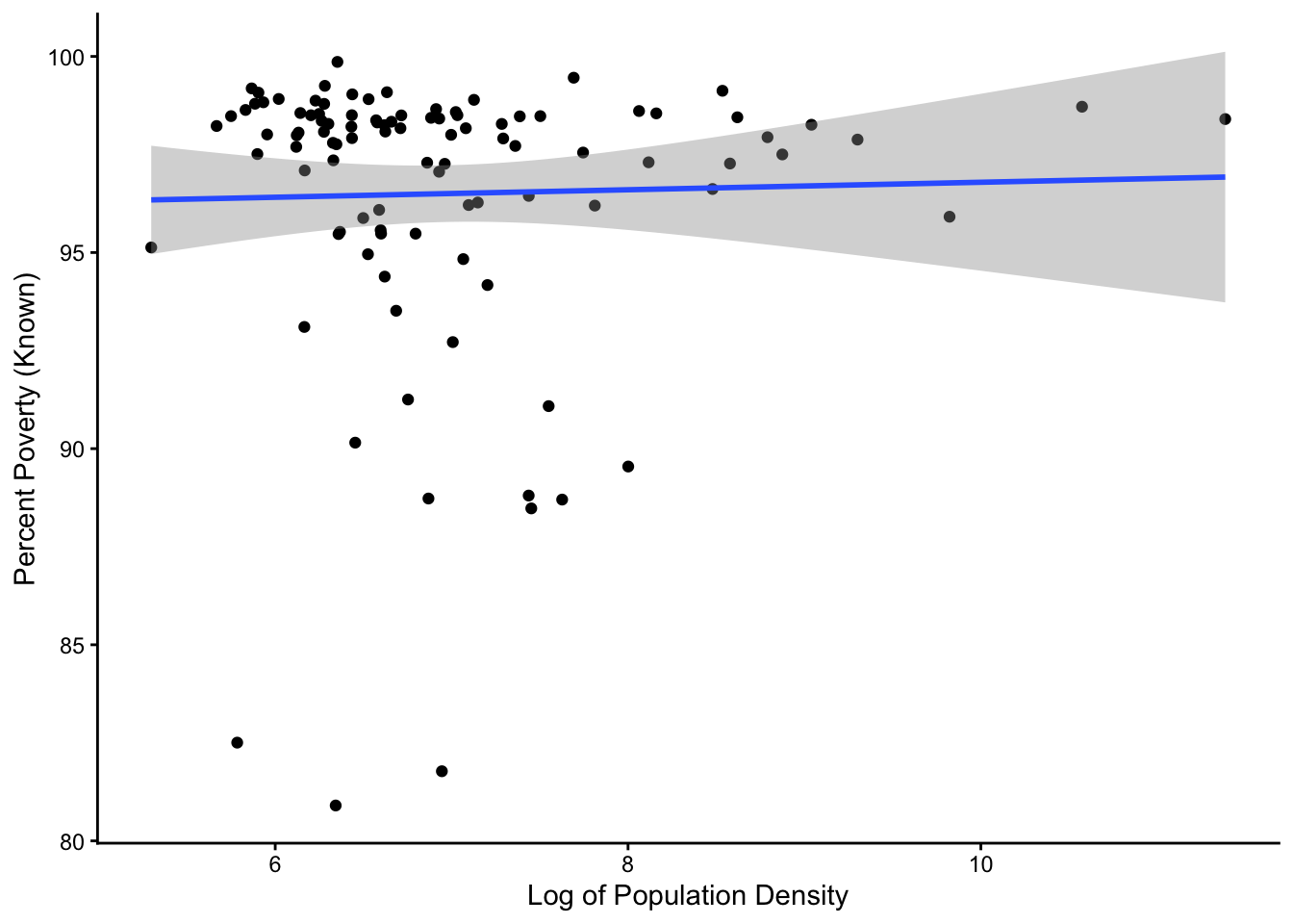
You have heard that many cities and urban areas are worse off than rural areas, but as someone who has talked to people from rural and urban areas, you are not sure if that’s true. You decide to compare the total poverty rate for different counties (percpovertyknown) to the log of the population density (popdensity) in each county in Illinois, home to many rural farm counties as well as some of the largest cities in the country.
Only log transform popdensity - leave percpovertyknown. Don’t worry about normality.
# dataset in tidyverse# if you load tidyverse, you have the datasetIL <- midwest |>filter(state =="IL")
`geom_smooth()` using formula = 'y ~ x'
Based on what you find, how are poverty rates affected by population density?
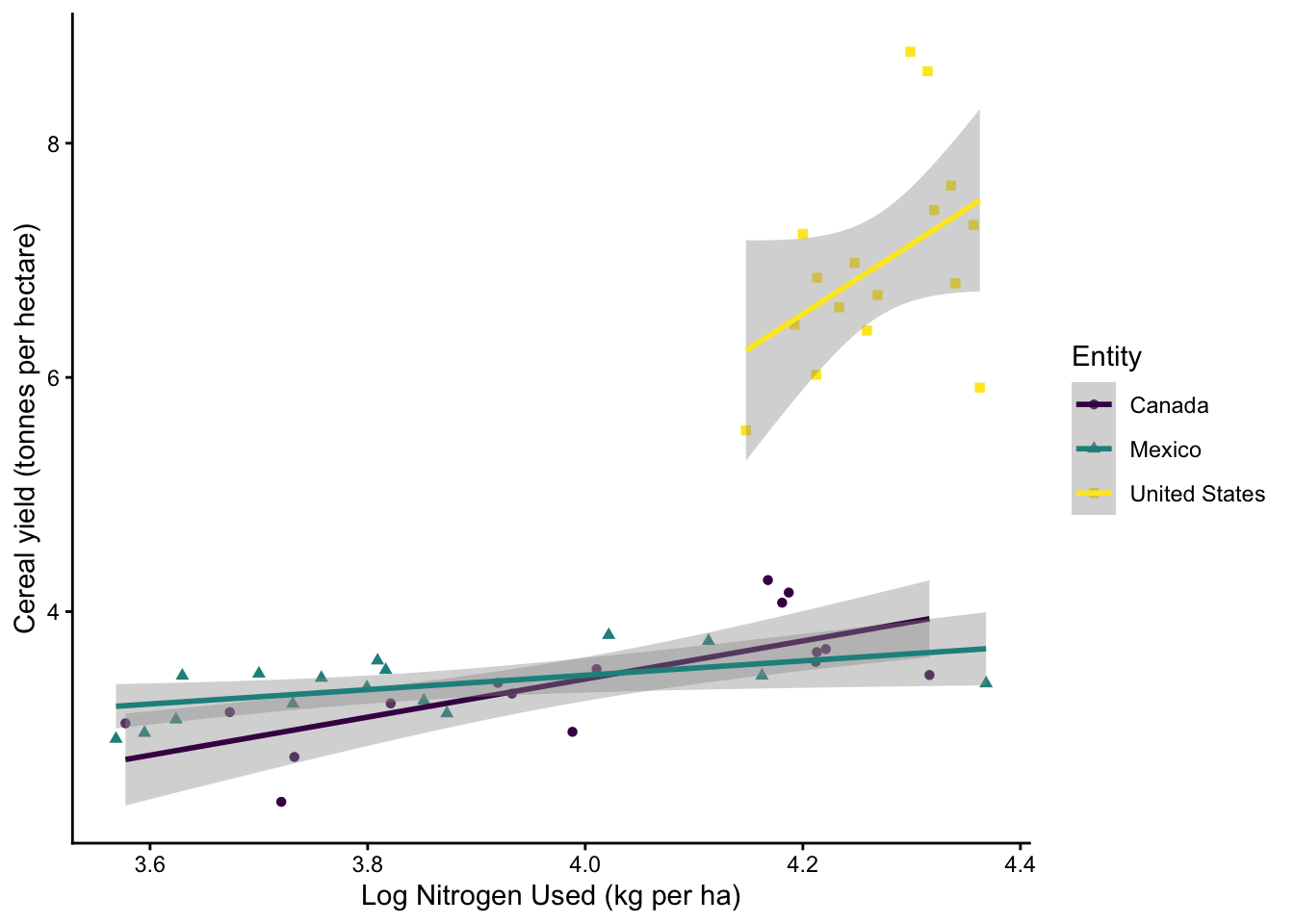
14.5.4 Q4: Fertilizer
You want to see just how effective fertilizer is at increasing crop yields. You decide to compare nitrogen fertilizer use to cereal yield (in tonnes per acre) in the Canada, Mexico, and the United States. You wanted to see (1) what overall trends exist in the overall dataset and (2) whether slopes are different between different countries.
In order to see if slopes are different, you will have to do an ANCOVA - a two-way ANOVA with interaction!
To run an ANCOVA:
run your model as you would usually, but show the interaction using *
lm.mod <- lm(y ~ x*block, data)
view the interaction using the command anova
anova(lm.mod)
You will see lines for the effect of x, the effect of group, and the effect of x:group
Check for the line showing x:group to see if slopes differ
tuesdata <- tidytuesdayR::tt_load(2020, week =36)
---- Compiling #TidyTuesday Information for 2020-09-01 ----
--- There are 5 files available ---


── Downloading files ───────────────────────────────────────────────────────────

  1 of 5: "arable_land_pin.csv"
  2 of 5: "cereal_crop_yield_vs_fertilizer_application.csv"
  3 of 5: "cereal_yields_vs_tractor_inputs_in_agriculture.csv"
  4 of 5: "key_crop_yields.csv"
  5 of 5: "land_use_vs_yield_change_in_cereal_production.csv"