library(tidyverse)

cinnyris <- read_csv("https://raw.github.com/jacobccooper/biol305_unk/main/datasets/cinnyris.csv")

male_cinnyris <- cinnyris |>
  mutate(Genus = as.factor(Genus)) |>
  mutate(Species = as.factor(Species)) |>
  mutate(Subspecies = as.factor(Subspecies)) |>
  filter(Age == "Adult") |>
  filter(Sex == "Male") |>
  select(-`Collection Name`, -Locality, -Country, -Age,
         -`Notes / Existing Damage Precluding Measurements`) |>
na.omit()15 Multivariate methods
15.1 Multivariate analyses
Multivariate analyses are commonly used to help understand the variation that exists in large, multidimensional datasets. These analyses can help us understand relationships among individuals and help us determine how many groups (and what groups) exist in a dataset.
For this particular walkthrough, we will be using data on the Northern Double-collared Sunbird Cinnyris reichenowi sensu lato complex from equatorial Afromontane regions (Cooper et al. 2021a, b).
15.2 Principal components
Click here for an overview of PCA
A very common method of visualizing variation in population is using principal components analyses (PCA). Principal components help collapse multidimensional data into a few dimensions that explain the most variation possible across the dataset.
For principal components, we want to use the library vegan.
library(vegan)Loading required package: permuteThe function for principal components in vegan is rda, which will only work on a whole dataframe with no non-numeric data. Thus, we must create a new object of only numerical data and then re-merge it with the original dataframe. The row order is maintained, so this will not be an issue.
male.cinnyris.data <- male_cinnyris |>
  select(-Genus, -Species, -Subspecies,
         -Collection, -Catalog, -Locality2, -Sex)

cinnyris.pca <- rda(male.cinnyris.data)

cinnyris.pca
Call: rda(X = male.cinnyris.data)

              Inertia Rank
Total              23
Unconstrained      23    6

Inertia is variance

Eigenvalues for unconstrained axes:
   PC1    PC2    PC3    PC4    PC5    PC6
15.620  4.443  1.940  0.877  0.076  0.040
Above, we can see that we now have a complex object that contains our PCA. We can use the function biplot to see how our data look and how our variables contributed to the principal components.
biplot(cinnyris.pca)
ordihull(cinnyris.pca,
         group = male_cinnyris$Subspecies)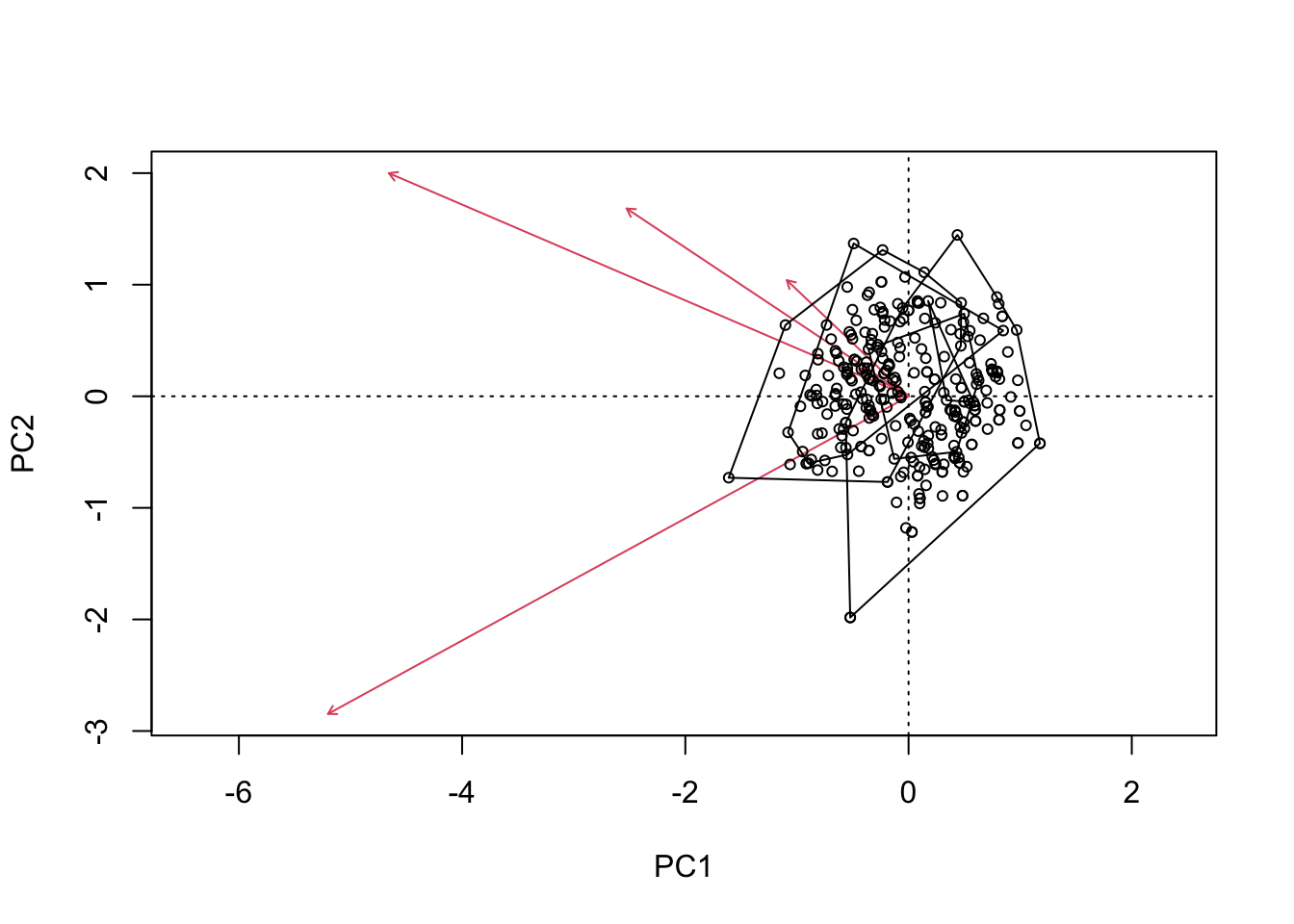
We can also do a ggplot to color our data and see how it works. Let’s combine our datasets so we can do this.
cinnyris.male.pca <- cbind(male_cinnyris,
                           # extract PC values
                           cinnyris.pca$CA$u)

ggplot(cinnyris.male.pca, aes(x = PC1, y = PC2)) +
  geom_point() +
  theme_classic()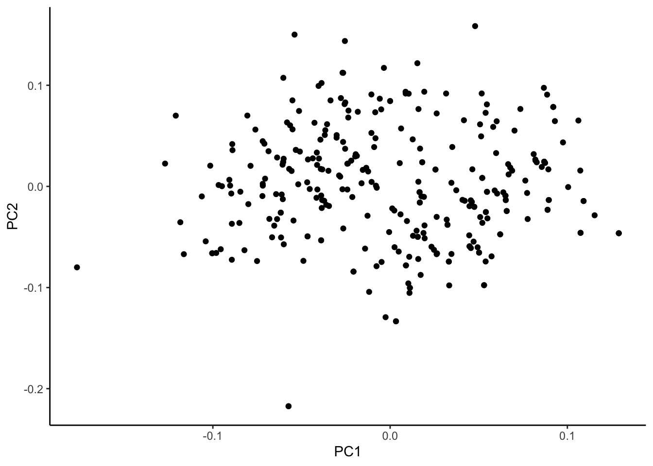
To the naked eye, these data seem to fall into two major clusters. This can be examined again, this time assigning colors to one of our explanatory variables: subspecies.
ggplot(cinnyris.male.pca, aes(x = PC1, y = PC2, colour = Subspecies)) +
  geom_point() +
  stat_ellipse() +
  theme_classic()
Too few points to calculate an ellipseWarning: Removed 1 row containing missing values or values outside the scale range
(`geom_path()`).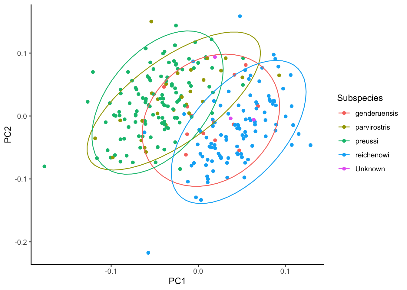
As we can see, many of these birds fall into one of the two groups. Only one population - genderuensis - seems to really bridge both groups.
The following shows how each variable contributed to each principal component:
cinnyris.pca$CA$v PC1 PC2 PC3
Right.wing.chord -0.61936877 0.498711666 0.60193981
Tail.length -0.69190828 -0.709947486 -0.12739287
Culmen.length -0.33598591 0.419621089 -0.62835637
Bill.depth..base.of.feathers.on.mandible. -0.01633872 0.004353418 -0.01231269
Bill.width..base.of.feathers.on.maxilla. -0.05865394 0.061714372 -0.09962101
Left.Tarsus -0.14509132 0.259522190 -0.46532983
PC4 PC5
Right.wing.chord 0.07304690 -0.001241684
Tail.length 0.02988534 -0.008716903
Culmen.length -0.53855805 -0.161236784
Bill.depth..base.of.feathers.on.mandible. -0.05951994 0.216257889
Bill.width..base.of.feathers.on.maxilla. -0.08219923 0.962867346
Left.Tarsus 0.83272259 0.006646209
PC6
Right.wing.chord -0.0002699604
Tail.length -0.0062803042
Culmen.length -0.0125622441
Bill.depth..base.of.feathers.on.mandible. 0.9742958451
Bill.width..base.of.feathers.on.maxilla. -0.2212610835
Left.Tarsus 0.0399226008We can also see the percent variance explained by each axis, which is contained within the eigenvectors of the PCA:
cinnyris.pca$CA$eig/sum(cinnyris.pca$CA$eig) PC1 PC2 PC3 PC4 PC5 PC6
0.679234583 0.193214694 0.084367157 0.038143954 0.003291025 0.001748588 The first principal component explains 68% of the variation, and the second 19% of the variation.
15.3 Clustering
15.3.1 K-means clustering
Click here for K-means clustering
15.3.2 Hierarchical clustering
Click here for hierarchical clustering
15.4 Homework
15.4.1 Disentangling microbiomes
This is an example problem. These data are from (Couper et al. 2019).
# Run this whole chunk to load data

microbiome <- read_csv("https://zenodo.org/records/4940316/files/MicrobialCommunityAssembly_Dryad.csv") |>
  t() |>
  as.data.frame()
New names:
Rows: 36 Columns: 69
── Column specification
──────────────────────────────────────────────────────── Delimiter: "," chr
(69): ...1, PW001, PW005, PW012, PW013, PW014, PW015, PW016, PW017, PW01...
ℹ Use `spec()` to retrieve the full column specification for this data. ℹ
Specify the column types or set `show_col_types = FALSE` to quiet this message.
• `` -> `...1`colnames.x <- microbiome[1,]
colnames(microbiome) <- colnames.x
microbiome <- microbiome[-1,]